Tech
iPhone 16 redesign leak: just hype or a meaningful facelift?
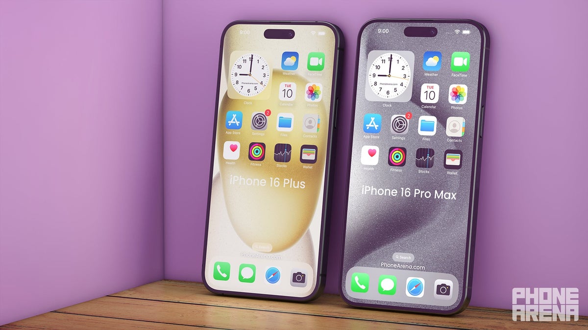
What’s new with this design?
From the leaked video, it looks like the iPhone 16 is set to bring some interesting changes. The most noticeable update is the introduction of the Capture Button on the bottom right-hand side of the phone. The case has a cutout, so it may be a capacitive button, as some people speculated earlier.
This button is expected to be customizable, allowing you to quickly access functions like the camera, flashlight, or other shortcuts directly from the side of the phone.
On the left side, we have three buttons – this is where the buttons for volume are situated, as well as the ring/mute switch, which, given the fact there’s no cutout for it, may be replaced by the 15 Pro’s Action Button. Another change is the alignment of the camera lenses on the back, which has been in the rumor mill for what seems like ages now. Reportedly, the change is for the iPhone 16 to be able to shoot spatial video for Vision Pro.
Comparing to iPhone 15, 14, and 13
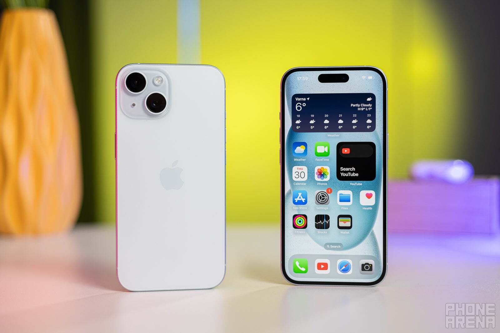
The iPhone 15. | Image Source – PhoneArena
- iPhone 15: The iPhone 15 stuck with the flat-edged design introduced with the iPhone 12. It had a slight camera bump on the back with a diagonal arrangement for the lenses. It brought Dynamic Island instead of the notch. The iPhone 15 also introduced some incremental improvements in the camera system and a new chip for better performance. It maintained a similar premium look with its aluminum and glass build.
- iPhone 14: Similar to the iPhone 15, the iPhone 14 also featured a flat-edged design. The major changes from the 13 to the 14 were mostly internal, with improvements in the camera system and battery life. The design remained pretty much the same, with minor tweaks to the camera layout.
- iPhone 13: The iPhone 13 was where Apple first introduced the diagonal camera arrangement, which was a noticeable change from the iPhone 12. It also had a slightly smaller notch on the front, which provided a bit more screen real estate. The design was otherwise very similar to the iPhone 12, with flat edges and an aluminum frame.
Compared to these models, the iPhone 16‘s design changes are more noticeable. The addition of the Capture button, the camera bump reduction, and the possible Action Button suggest that Apple is aiming to shake things up a bit. The Apple way, I might add – but still, it’s shaking things up.
What’s not new?
Despite these changes, some aspects of the iPhone 16 design remain consistent with previous models. The overall flat-edged look is something we’ve seen since the iPhone 12. It’s a design language that Apple seems committed to, and for a good reason – it offers a sturdy and premium feel that many people love, including myself.
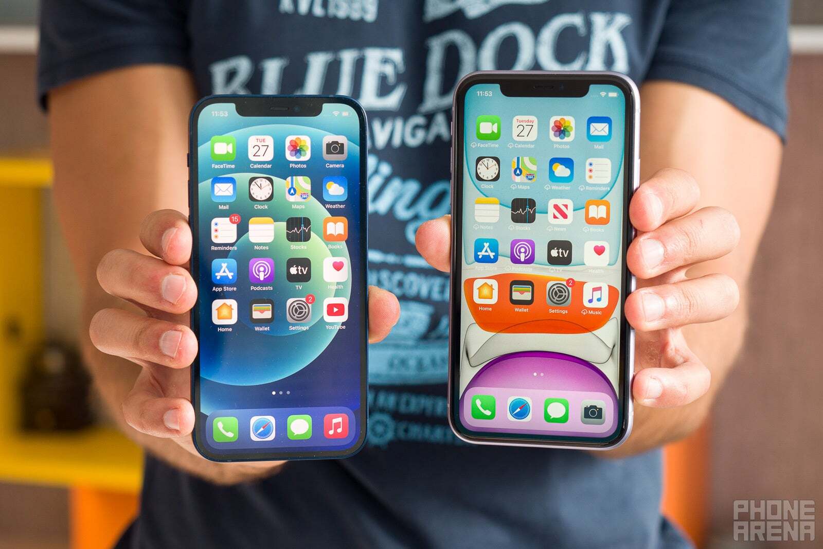

The iPhone 12 vs the iPhone 11. | Image Source – PhoneArena
The front of the phone, from what we can tell, isn’t changing much either. We’ll probably be getting the Dynamic Island from the iPhone 15. The rest of the buttons and where they are placed, as well as the overall form factor, are also likely to remain similar, making the iPhone 16 feel familiar to you if you’re currently rocking a recent iPhone model.
Is the new iPhone 16 design a major redesign?
So, is the iPhone 16‘s design a major overhaul, or is it just hype? Honestly, it seems like a bit of both.
On one hand, the introduction of the Capture button and the possible functionality it will bring is an exciting change. It suggests that Apple is looking to refine and enhance the iPhone’s design. Also, the video doesn’t reveal everything. We’re left wondering now about the actual thinness of the phone – I can’t really tell how thin it will be judging by a case.
On the other hand, many of these changes are incremental, and that’s glaringly obvious. They’re not as groundbreaking as, say, the shift from the iPhone 8 to the iPhone X, which introduced Face ID and an edge-to-edge display. The core design language remains the same, sporting flat edges and a similar front look. The changes are more about refinement than revolution – for good or for bad.
But hey, everything is subjective in this world. Including a redesign. I can understand people who consider the changes major just because Apple doesn’t do any change whatsoever… and I can understand people who think it’ll just look like any iPhone out there.
That doesn’t make it less exciting though. Actually, I’m pretty curious to see what the capture button does and how it makes the iPhone even more convenient. Which it’ll most likely do. And given the fact that it seems the iPhone 16 Pro Max is indeed getting a more major (if one can say that) redesign, I’m excited for the iPhone 16 event even more.





:max_bytes(150000):strip_icc()/roundup-writereditor-loved-deals-tout-f5de51f85de145b2b1eb99cdb7b6cb84.jpg)


