Fashion
Gucci

Sabato De Sarno’s Gucci Rides a New Wave
Review of Gucci Spring 2025 Fashion Show
By Angela Baidoo
THE COLLECTION
THE VIBE
THE THEME
What should have been a celebratory end to a confident week of refreshing brand codes and proposing new ideals for the future of menswear, Sabato De Sarno’s Gucci was to be the penultimate show set to conclude Milan fashion week, but in a strategic move (rather than mere coincidence) by Gucci’s last creative director Alessandro Michele, who has taken up the helm at Valentino, the morning of De Sarno’s menswear show was overshadowed by the unexpected release of the formers first presentation (before his main show in September) which consisted of a lookbook of over 180 images. It had the intended effect of creating newsworthy buzz which flooded the feeds of editors, buyers, and stylists who were in town for fashion week. But it also had the inadvertent effect of leading many to comment that the collection very-much resembled Michele’s Gucci-era, and that maybe it was time to seek invest and start his namesake brand. We can only be thankful that what De Sarno presented was strong enough to cut through the noise.
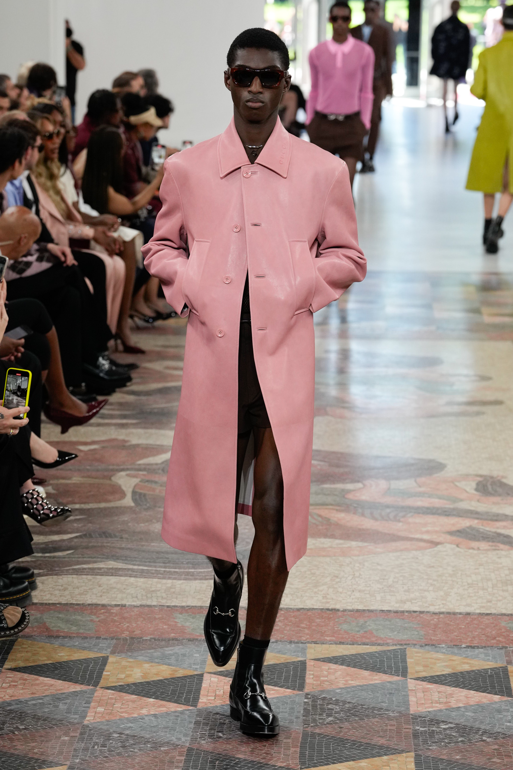
Whether this was part of Sabato De Sarno’s bigger picture for Gucci all along is hard to decipher, but above the noise that is the constant hum of the opinionated online, there has been an intentionality to the creative directors rebuilding of the brand in his image. Without giving into critics or deviating from the path he is walking, De Sarno has been very strategic in the way he has approached his tenure. First there was the establishing – and reestablishing, in some cases – of the key pillars, whether that be the Rosso Ancora red shade, the horse-bit loafer (including the updated creeper), the Jackie bag, embossed leather, and youthful tailoring. And now, with both the women’s cruise collection shown in London and today’s spring 2025 outing under his belt, we are witnessing a much more confident designer at work.
Incontri, which translates to encounters, and was how the show notes spoke of the meaning behind the collection, was again a reference to coastal living and the sea (a trending escape that has been on the minds of Milanese designers throughout this season). In this iteration De Sarno tackled the idea by considering the meeting of the “city and the beach”, where the notes go on to explain that “ultimately, it speaks about freedom…I hope that people feel free and welcomed in my clothes”.
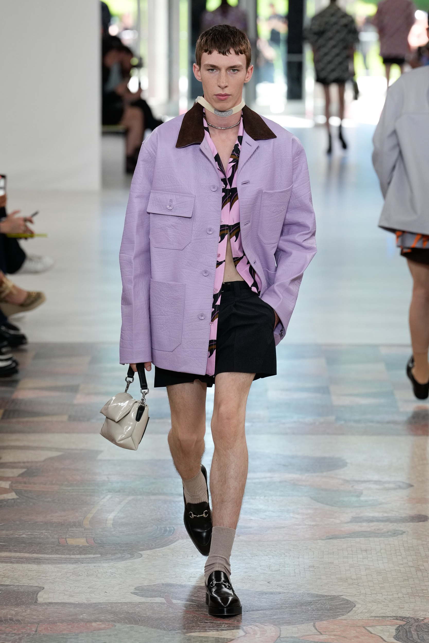
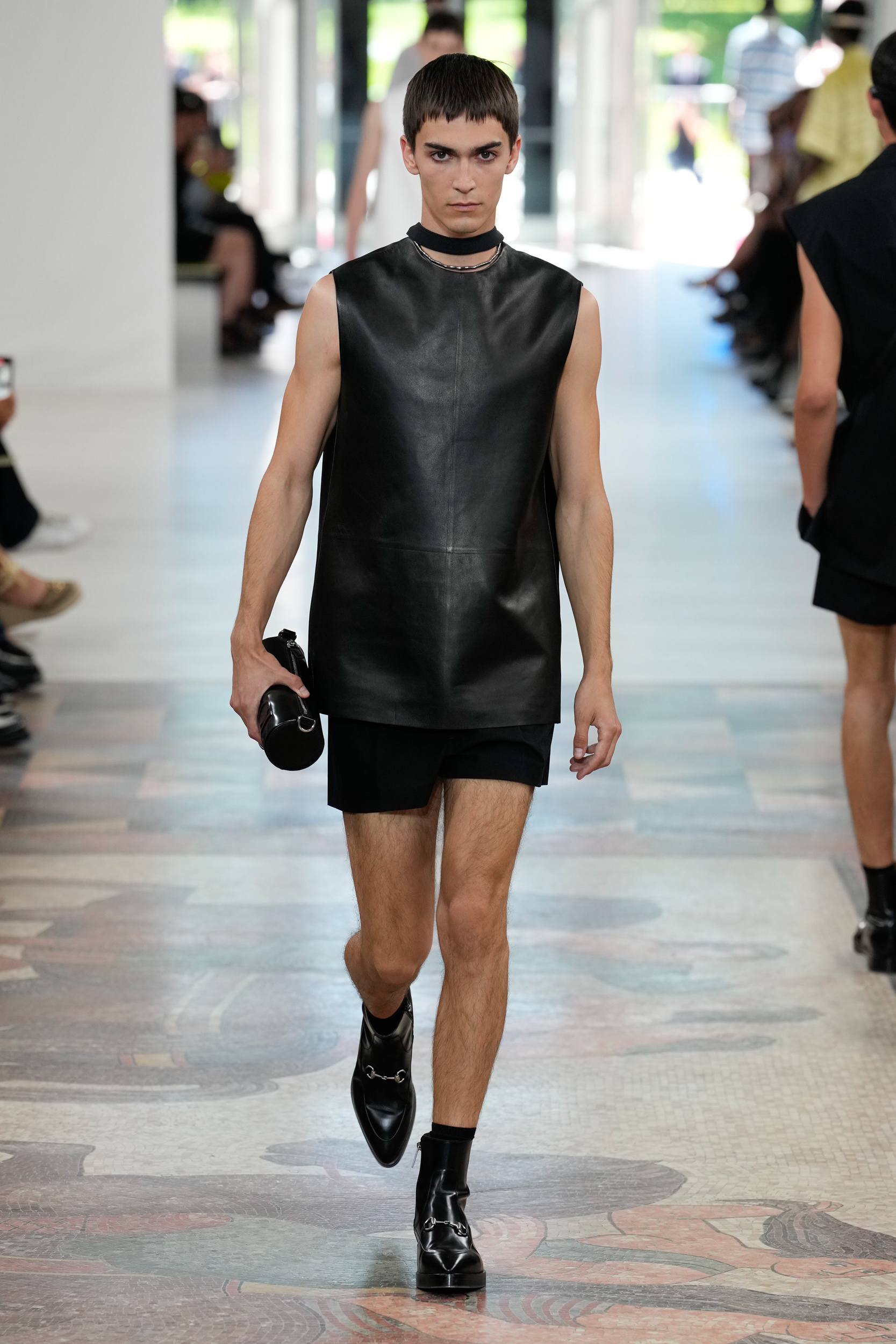
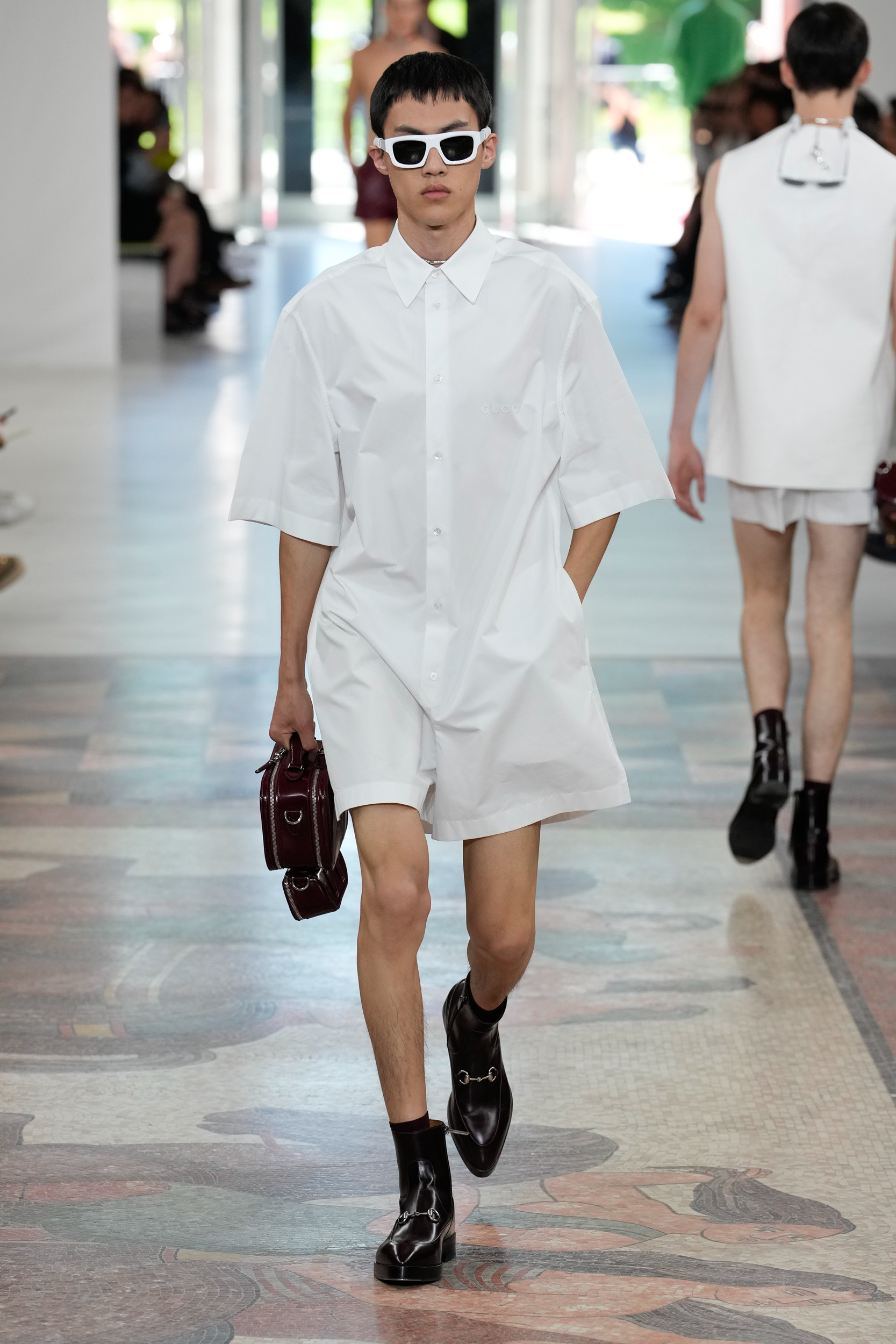
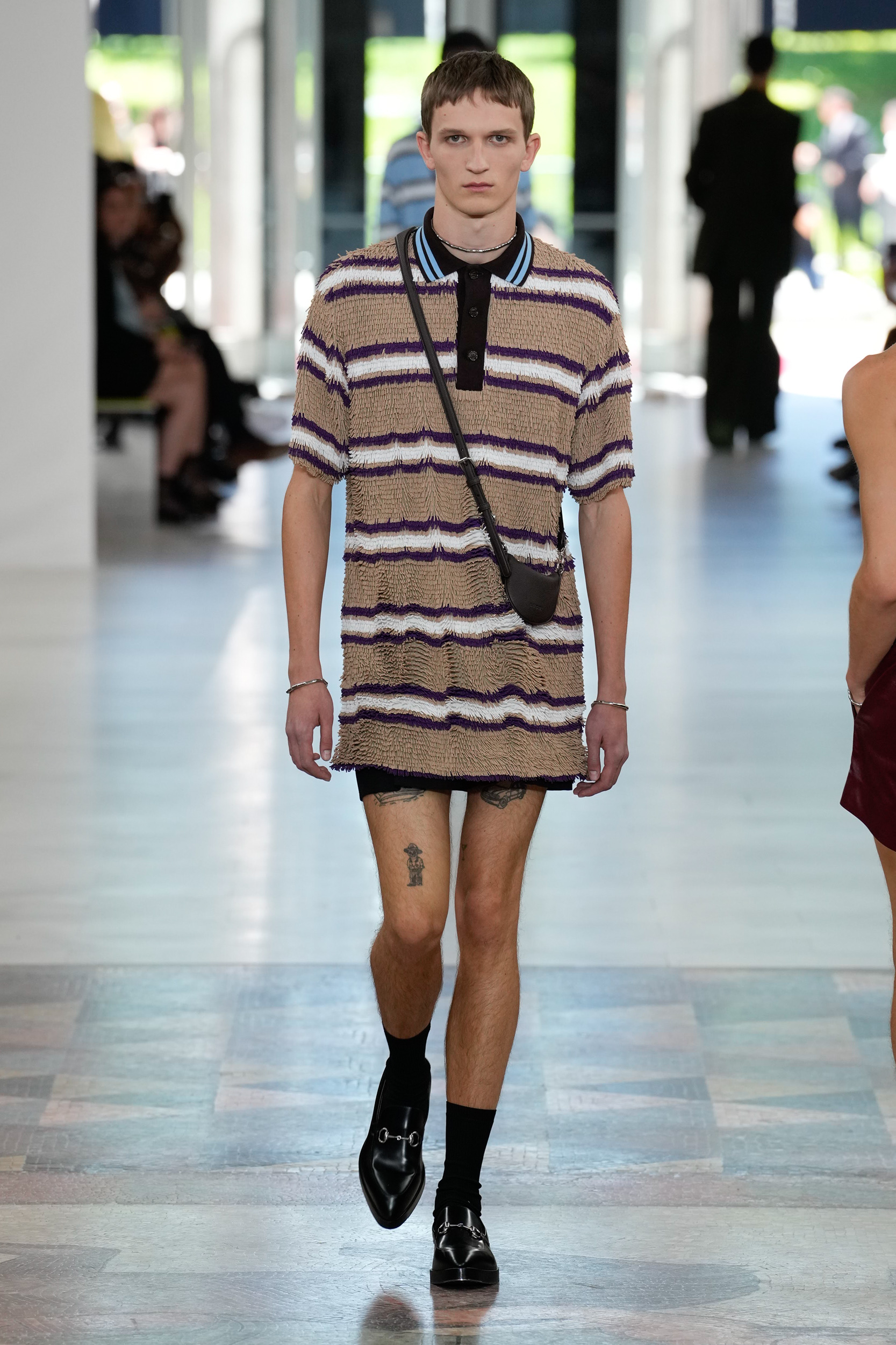
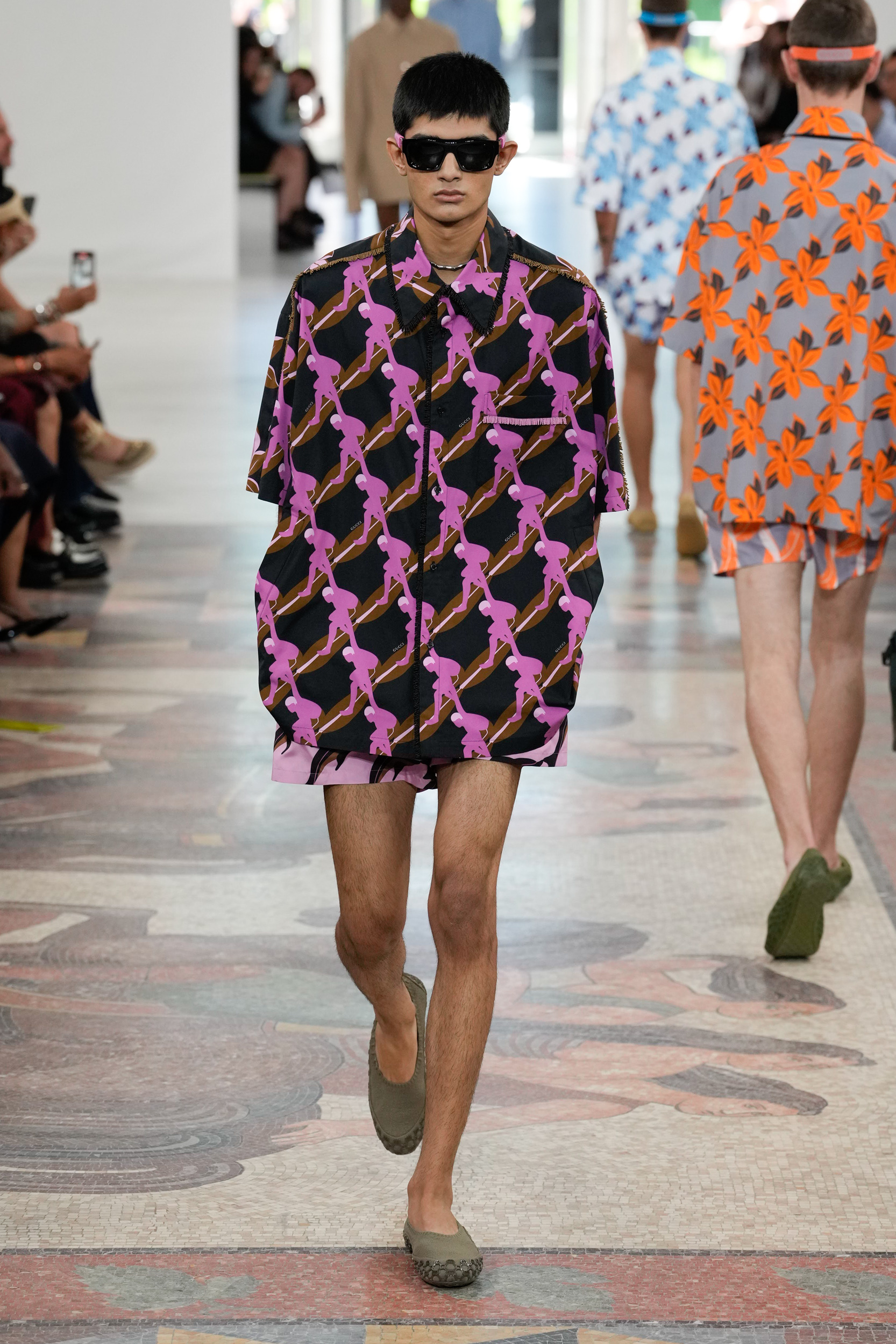
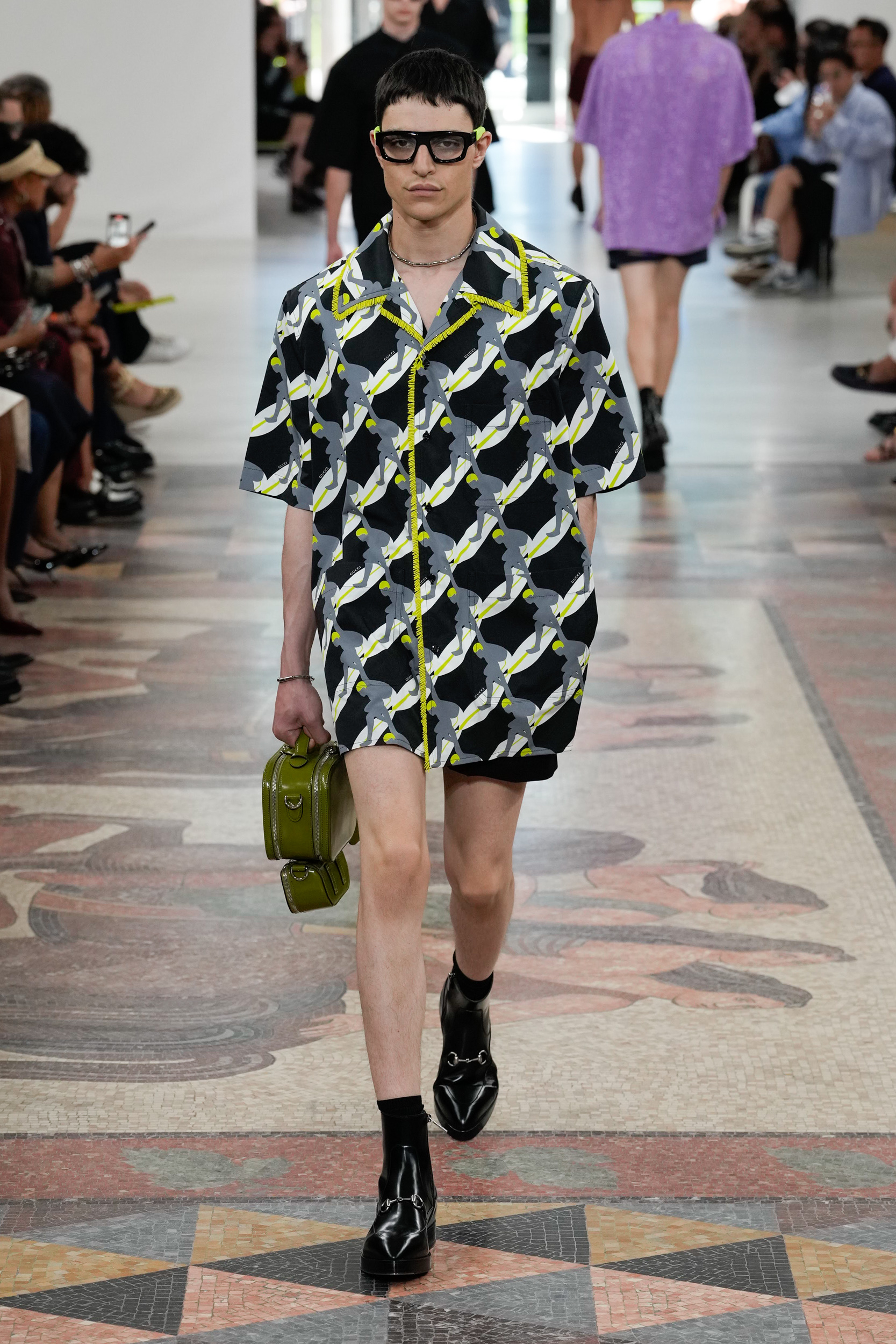
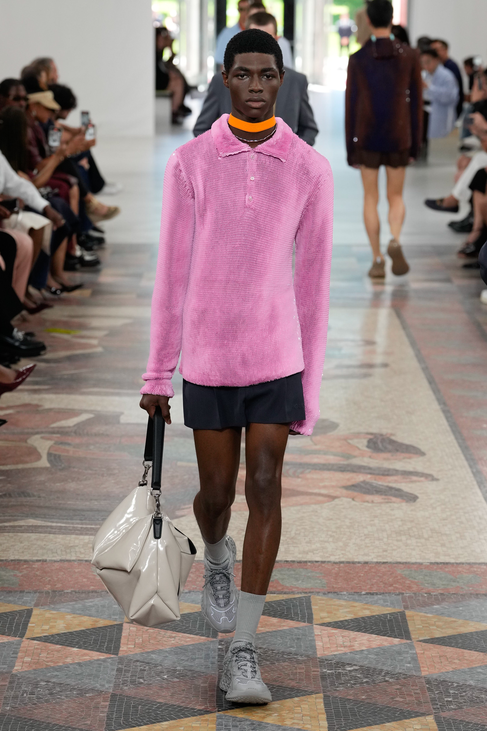
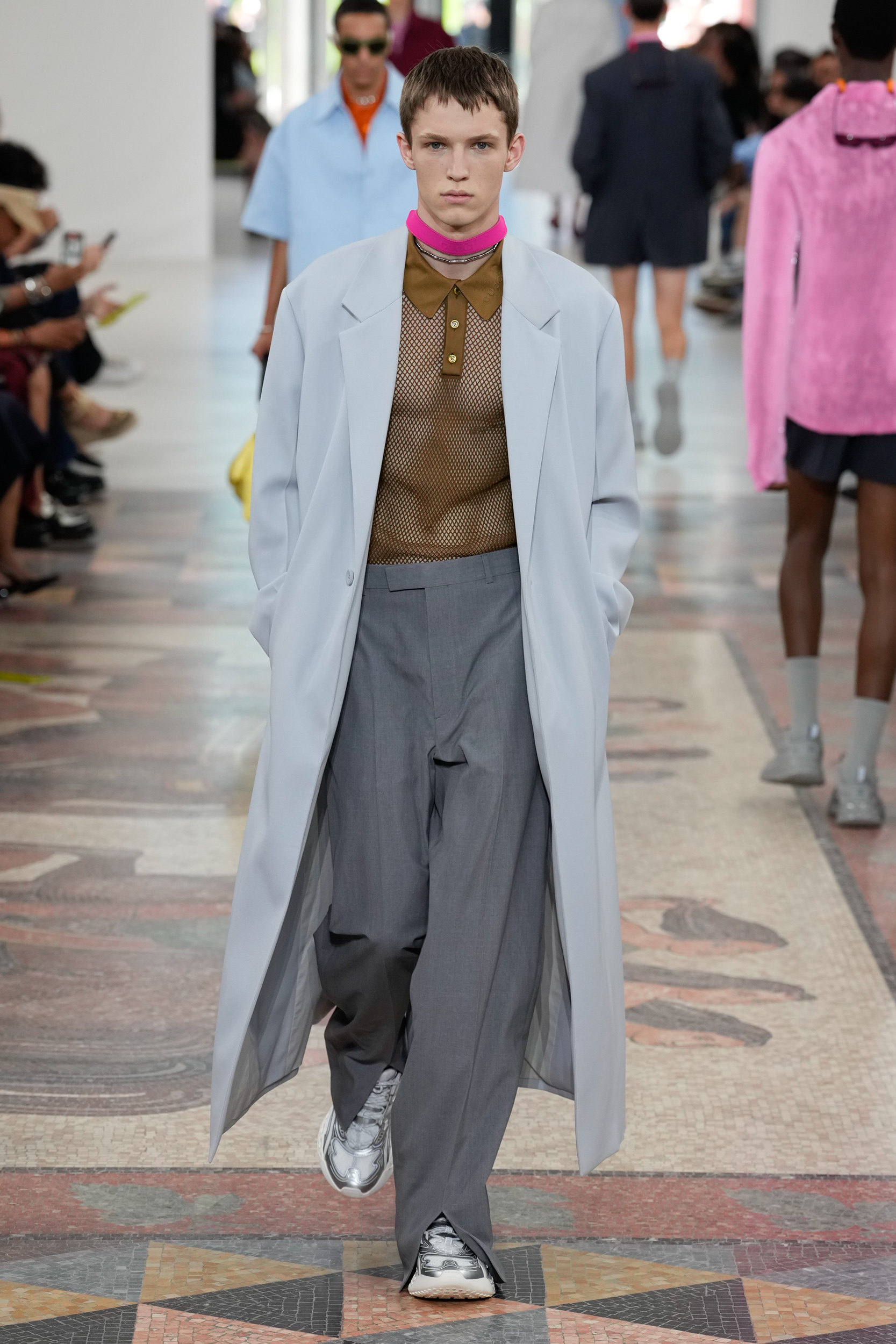
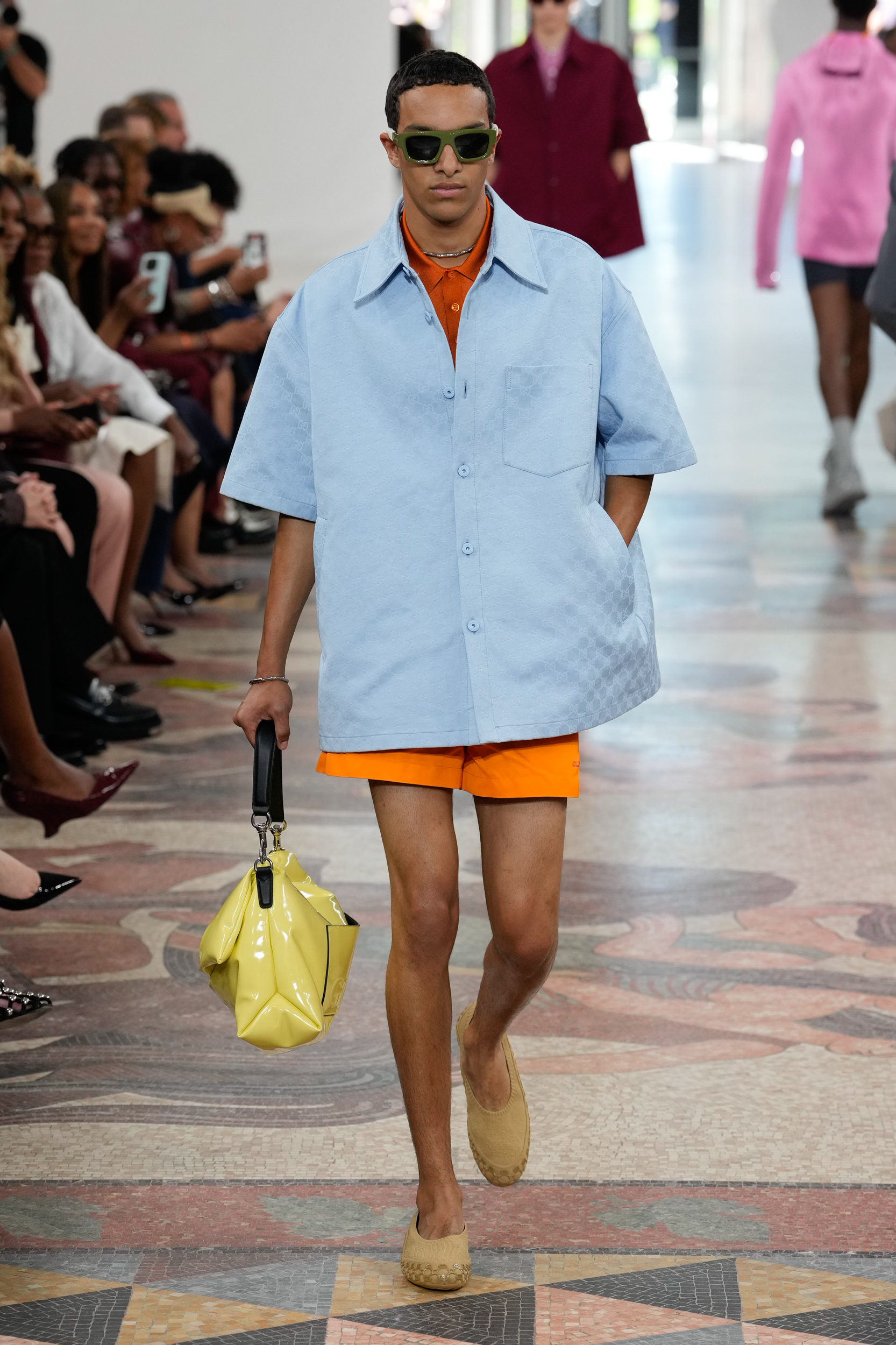
In that respect there was the interplay between trompe l’oeil surface textures, graphic prints inspired by the sea, sharp silhouettes and subverted sportswear designed for “people who love life” with each look being styled with a carefree attitude. Longline coats jolted with a shock of electric colour included pockets constructed with a directional placement in that they sat at waist – instead of – hip height, and no Bermuda shorts here (despite surfers being on the moodboard at Gucci HQ), instead the Gucci man will be mirroring his female counterpart in short shorts. One-and-done dressing in the form of a crisp shirting romper was itself an Incontri of the shows key items of shirts and shorts. But it was across the shows shirts – referred to in the notes as the “Coastal” section – where there was the introduction of a new print direction for spring. Clarified as “Not classic bowling shirts” the shirts in question came complete with three pockets inspired by the utility world, add to that their oversized nature and they could almost spill over into jacket territory. But the simple menswear staple became a canvas for energetic graphics which depicted ‘surfers, dolphins, banana leaves, and hibiscus flowers’ or were taken up a notch on the luxury craft scale with all-over beaded fringing in shimmering or stripe finishes.
If there is one thing that no one can argue is a major draw of this Gucci era, its the use of colour as a tool to create covetable products. Here we were treated to chemical pinks, acid greens, deep lavenders, and high-vis orange splashed across prints, worn tone-on-tone in a sneakers and socks combination, and creating a soft kink take on the polo top in mesh. Presenting just these colours would have been an even stronger statement but as this is a menswear season there was the overlaying of these shocking brights with classic grey and navy tailoring, for those who require easing into a mutli ‘colour’ wardrobe.
With so many having the power to make or break careers from the comfort of their keyboards, it can be a hard task for creatives (and if we’re being honest upper management) to stay the course. And as the never-ending game of creative director musical chairs has proved the industry doesn’t seem to know what it wants in a design lead. So, it stands to reason that when someone such as De Sarno gets the opportunity to take the reigns of a storied fashion house, they put the blinkers on and do things there way, if only so they can say that they did.
THE BUZZWORDS
Graphic impact, subverted sportswear, trompe l’oeil tactility
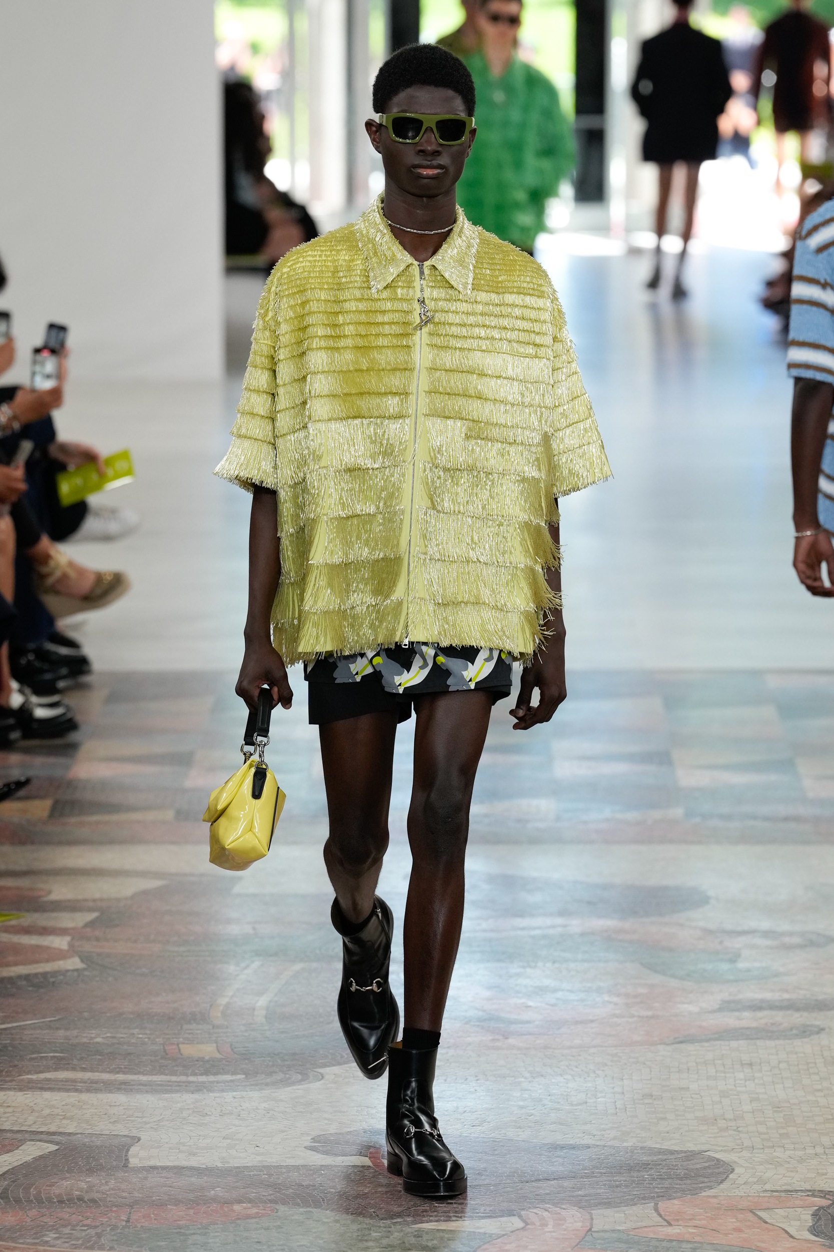
THE SHOWSTOPPER
Look #28
Having played with OTT fringed embellishment in previous womens collections, the skills of the Gucci atelier are showcased in the elevation of a minimalist zip front shirt for men.
THE DIRECTION
THE QUOTE
I feel free when there is no distance between my actions and my heart [and] I hope that people feel free and welcomed in my clothes.”
Sabato De Sarno, creativer director, Gucci
THE WRAP UP
In finding his stride, the creative director seems to be having more fun with the Gucci brand, especially when it comes to colour and texture. Here, the graphic nature of the resort shirts interspersed with electric pastel colours and soft neons are deserving of a summer ad campaign that communicates how much freedom of expression seems to be embedded in this collection. The designers way with innovating craft through embellishment should also have its own spotlight – even if only on social media as per the BTS films from the women’s Cruise 2025 show. As the polo shirts which appeared at first as clipped fur was actually heavily clustered sequins on the level of couture, a detail that could easily be missed when looking at a flat image.
The synergy between the women’s and men’s collections Is also working as a way to align the creative directors vision. So, if todays theme transfers to Septembers spring 2025 women’s show then this new wave should go some way to turning the tide towards an embracing of Sabato De Sarno’s tenure at Gucci.

Exploring Online Casino Gaming: A Guide to the Thrills and Strategies

The latest jobs in search marketing

Deloitte Ports and Freight Yearbook 2024: DAESCHI mid-year update | Infrastructure | Deloitte New Zealand

Dow soars more than 700 points to close at another record high

Albares reiterates Foreign Ministry recommendations to “travel safely” on holidays

Let’s take this offline: why indie fashion boutiques are back in fashion
:max_bytes(150000):strip_icc()/roundup-writereditor-loved-deals-tout-f5de51f85de145b2b1eb99cdb7b6cb84.jpg "I’m a Travel Writer, and Out of the 5 Million Prime Day Deals on Site, These Are the 12 I’m Shopping")
I’m a Travel Writer, and Out of the 5 Million Prime Day Deals on Site, These Are the 12 I’m Shopping

Military Installation Job Fairs: Setting Realistic Expectations for Veterans

Shooting at Baltimore’s Westside Shopping Center leaves man dead, two injured
