Summary
- Google Photos is getting a revamped UI, moving the Locked Folder front and center.
- The change will make it easier for users to access their sensitive photos and videos.
- The UI update is now available on Android and iOS.
There are lots of different cloud storage options, but if you’re looking for an app that’s dedicated for pictures and videos, then Google Photos is going to be it. Google Photos has long been a “go to” solution for many and is even better if you’re someone that heavily relies on Google’s other apps and services.
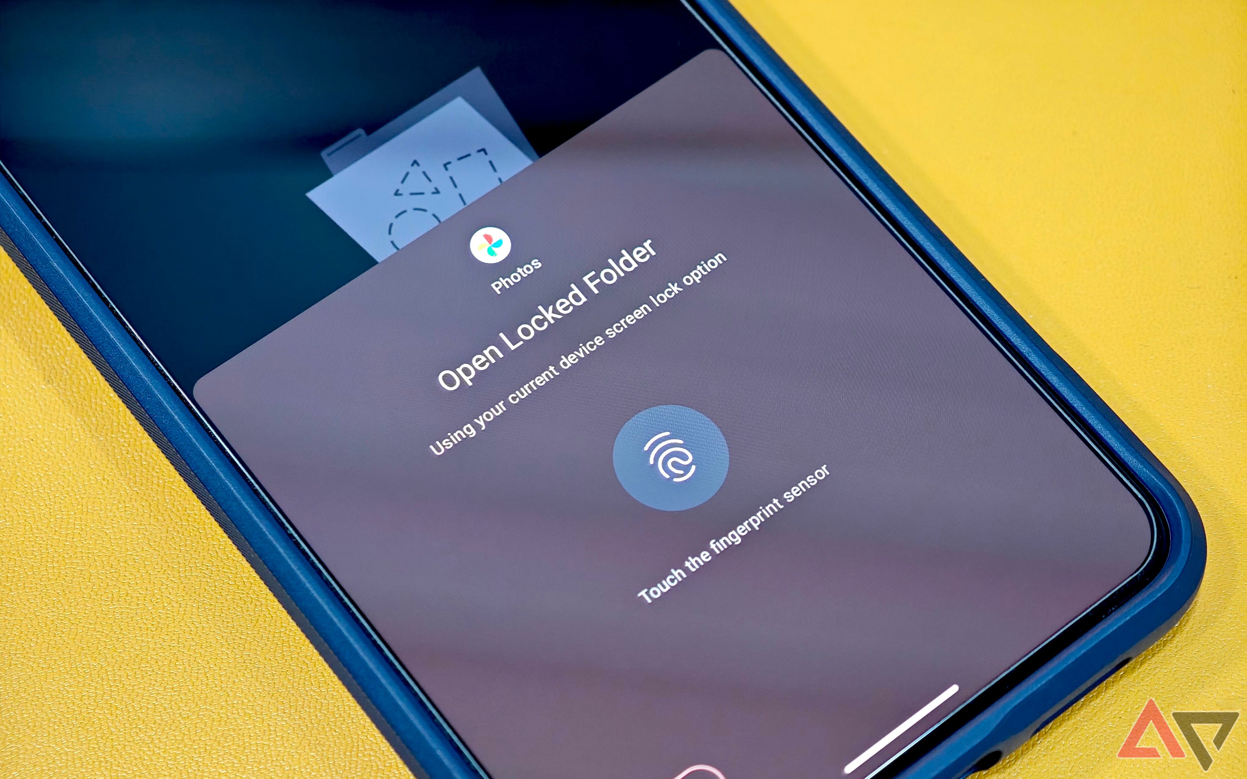
The brand has done a great job of adding new and useful features over time, and it now appears that Google is going to make a significant change to the Locked Folder that will literally bring it front and center. The change was spotted by the folks at 9to5Google, and will hopefully give users an easier way to access their sensitive photos and videos.
Users will now have quick access to the Locked Folder
If you’re unfamiliar with the Google Photo’s Locked Folder, it’s an area within the app that you can store any media that you want to keep private. Once media is added to this photo, it will be protected by a password and the media won’t show up in any gallery or other apps. While it’s a great thing to have if you’re trying to keep some parts of your life in the dark from others, the feature was buried in a menu system, making it harder to access.
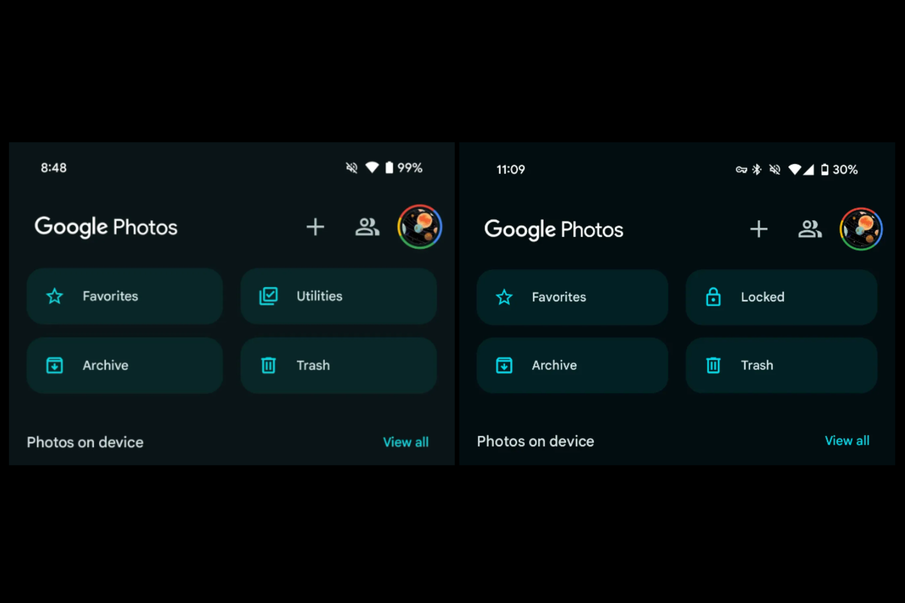
As mentioned before, going forward, the Locked Folder will now have a dedicated place in the Photos app that will provide users with a quick and easy way to access it. You can see how the UI of the app has changed, with the Utilities section being replaced by Locked. As far as Utilities, much of the functionality that was found in that portion of the app can now be accessed by hitting the “+” symbol towards the top, near the user’s profile image.
This update is now rolling out to Google Photos on Android and iOS, so if you’ve yet to update your app, be sure to do so now in order to get this new look. While some will be overjoyed by this change, others may have liked the previous look with the Locked Folder being a little more hidden. Let us know in the comments which one you like better.


:max_bytes(150000):strip_icc()/roundup-writereditor-loved-deals-tout-f5de51f85de145b2b1eb99cdb7b6cb84.jpg)


