Jobs
Jobs: QCEW Shows Further Evidence Of Wildly Inaccurate Headline Report

Compassionate Eye Foundation/David Oxberry
Originally published on July 05, 2024
By SchiffGold
The analysis below covers the Employment picture released on the first Friday of every month. While most of the attention goes to the headline number, it can be helpful to look at the details, revisions, and other reports to get a better gauge of what is really going on.
Current Trends
The BLS reported a gain of 206k jobs, which was above expectations. However, the trend this year has been a wildly divergent Household Survey and that continued again this month. The Household survey reported 116k jobs, which is 56.3% of the Headline number.
Figure: 1 Primary Report vs Household Survey – Monthly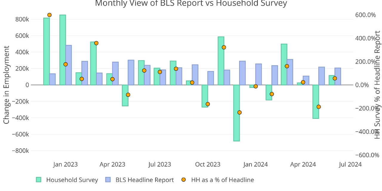
Halfway through the year, the total jobs from the Household Survey represent just 1.3% of the jobs reported by the Headline Report. For context, while the Headline Report has indicated total jobs of 1.33M, the Household Survey shows 16k jobs YTD. Those are two wildly different views of the labor market!
Figure: 2 Primary Report vs Household Survey – Annual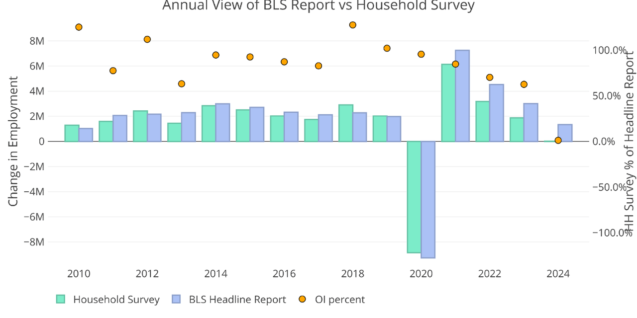
The BLS also publishes the data behind their Birth/Death assumptions (formation of new business). In June, the BLS assumed 59k jobs added to their birth/death assumptions.
Figure: 3 Primary Unadjusted Report With Birth Death Assumptions – Monthly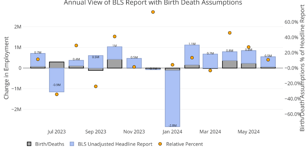
The annual view shows that birth/death assumptions make up more than 50% of the total jobs added YTD.
Figure: 4 Primary Unadjusted Report With Birth Death Assumptions – Monthly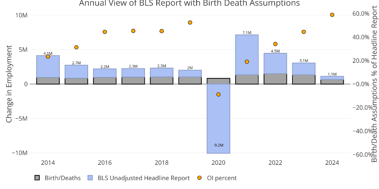
There is another report published by the BLS called the Quarterly Census of Employment and Wages (QCEW). According to the BLS, this is a far more accurate and rigorous report covering 95% of jobs available at a highly detailed level. Due to the rigor, the report is released quarterly on a 7-month lag. The latest report was published at the end of May to show Q4 2023.
The QECW was below the Headline Report for all 3 months of Q4 last year.
Figure: 5 Primary Report vs QCEW – Yearly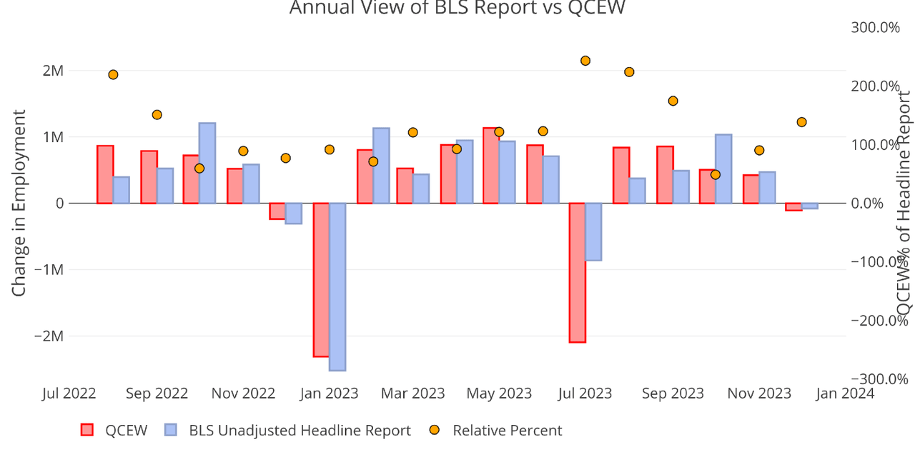
On an annual basis, you can see that the QCEW trailed the Headline number, representing 76% for all of 2023. This is the lowest percentage going back to 2010. The QCEW combined with the Household Survey shows that the Headline Report is clearly inaccurate and that has reached an extreme in 2023 and 2024!
Figure: 6 Primary Report vs QCEW – Yearly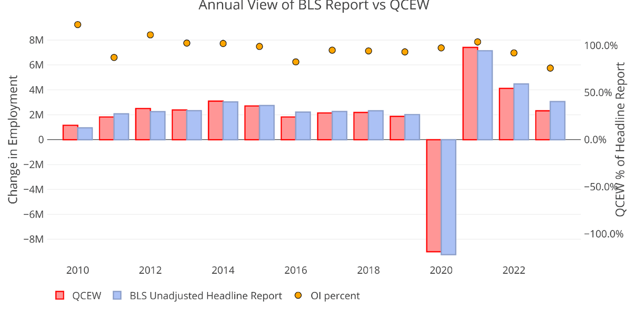
Digging into the Report
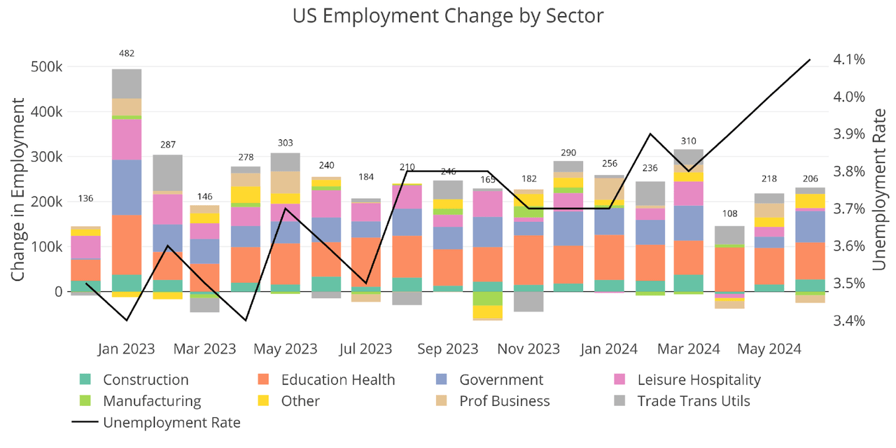
The 206k jobs surprised to the upside but also saw the unemployment rate rising again to 4.1%.
Another level of detail in the Household report shows full-time vs part-time job holders. In June, there was little change, but the net result was a loss of full-time jobs and a gain in part-time jobs.
Figure: 8 Full Time vs Part Time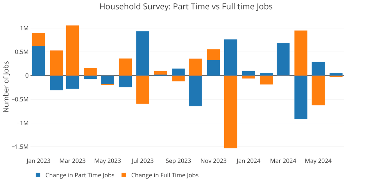
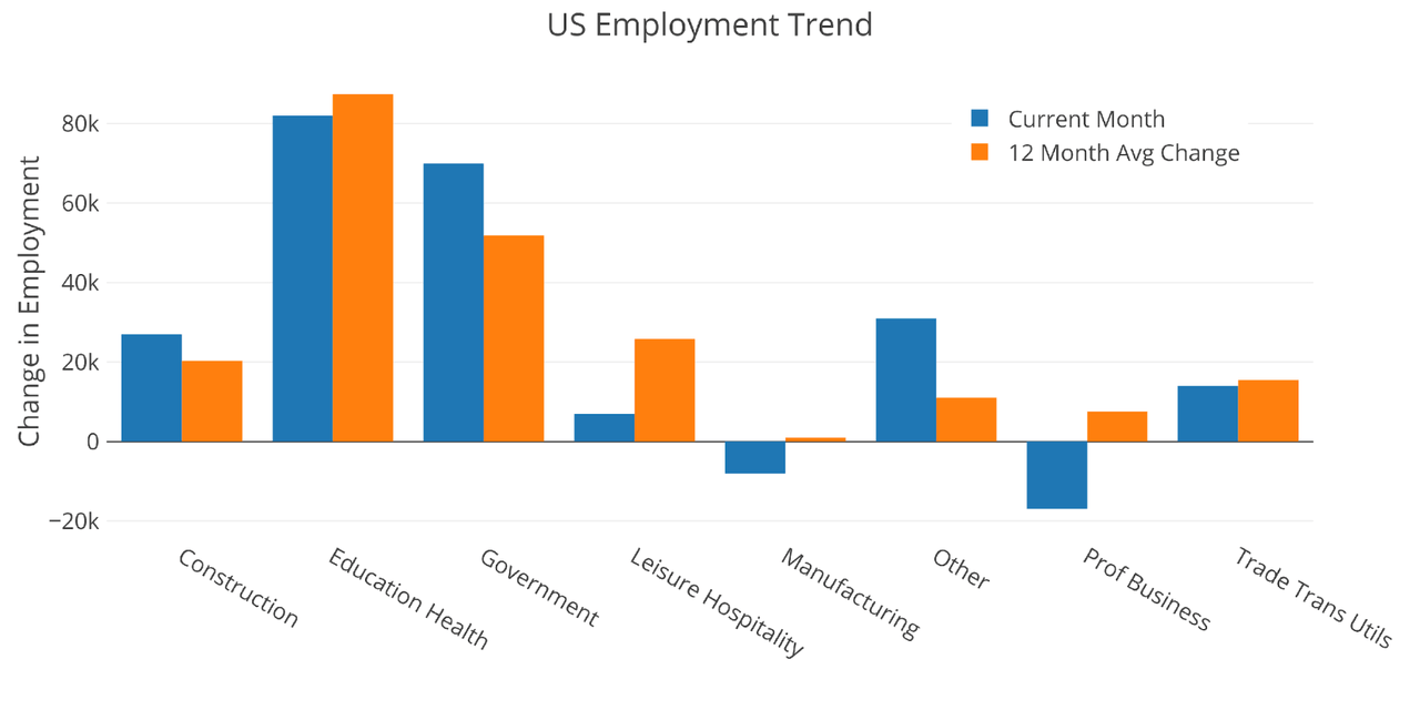
Jobs by Category
Only three of the eight categories were above the twelve-month trend.
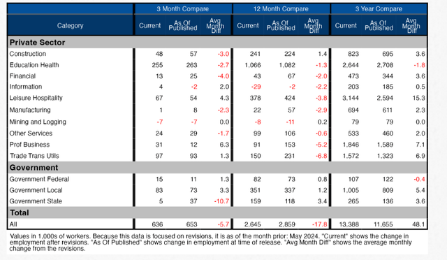
The table below shows a detailed breakdown of the numbers.
Figure: 10 Labor Market Detail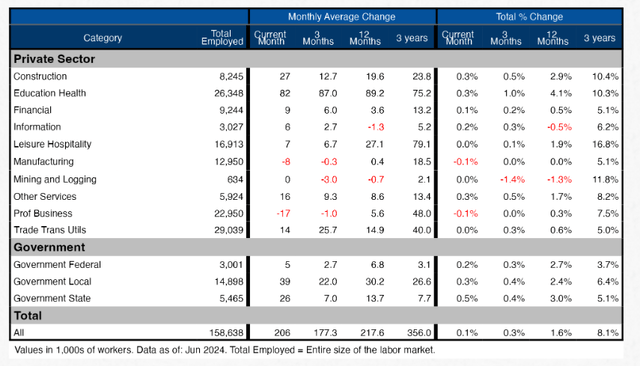
Revisions
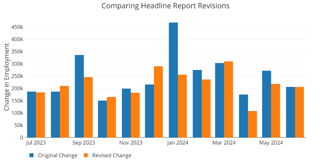
The chart below shows how the jobs data has been revised in recent months. From January to May, all the months except March have seen downward revisions.
Over the last three months, the data has been revised down by an average of 5.7k per month and 17.8k over 12 months. These revisions go unnoticed by the mainstream.
Historical Perspective
The chart below shows data going back to 1955.
Figure: 13 Historical Labor Market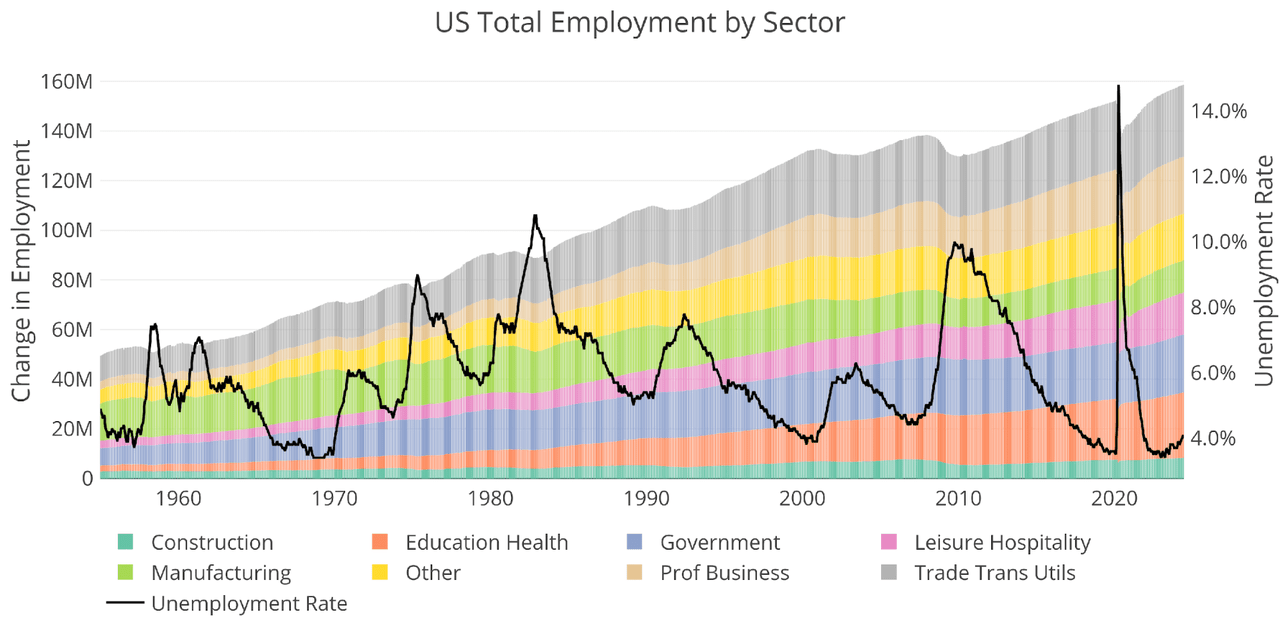
The labor force participation rate is still well below the highs before the Global Financial Crisis. This month it stayed steady at 62.5%.
Figure: 14 Labor Market Distribution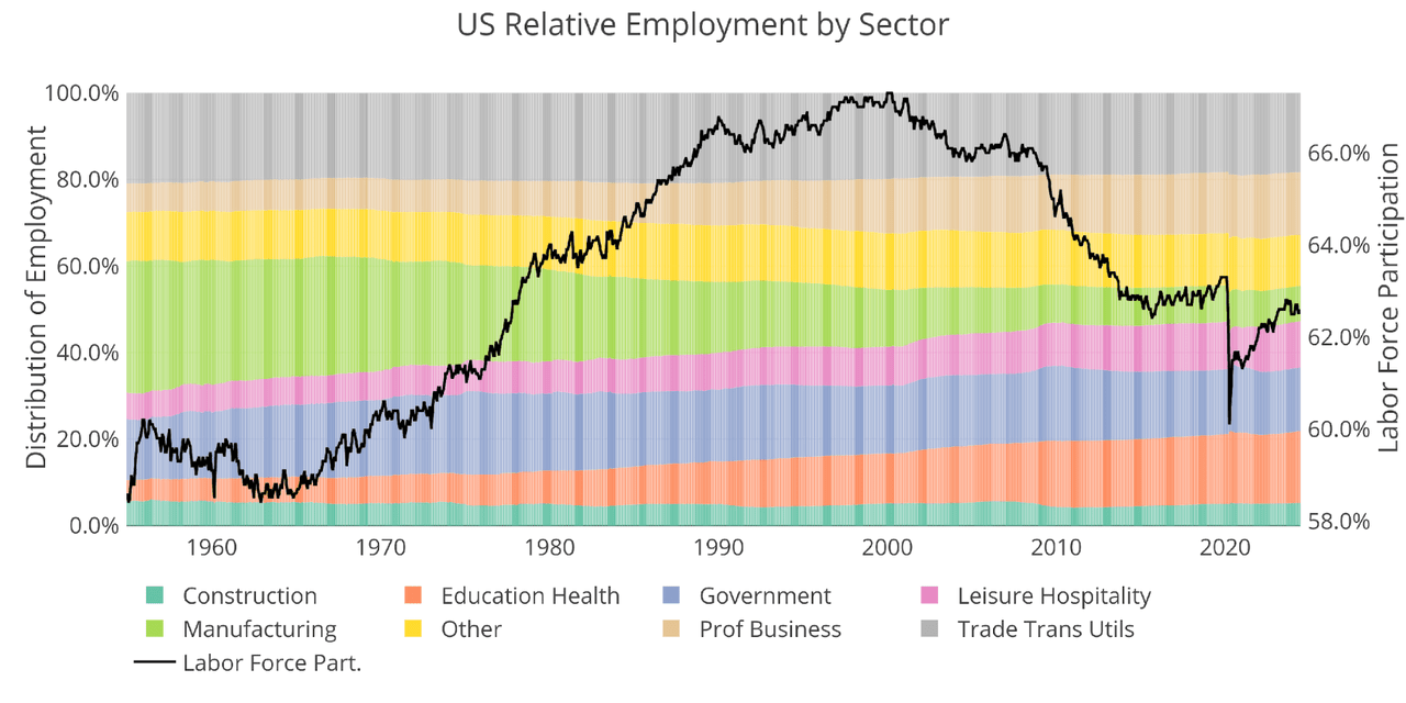
Conclusion
Headline numbers continue to show moderate strength but the Household Survey and QCEW tell an entirely different story. At some point, the reports will converge. It seems very likely that the Household Survey and QCEW are more accurate and communicate the true state of the labor market.
Data Source: All Employees, Total Nonfarm and also series CIVPART
Data Updated: Monthly on first Friday of the month
Last Updated: Jun 2024
Interactive charts and graphs can always be found on the Exploring Finance dashboard.
Editor’s Note: The summary bullets for this article were chosen by Seeking Alpha editors.



:max_bytes(150000):strip_icc()/roundup-writereditor-loved-deals-tout-f5de51f85de145b2b1eb99cdb7b6cb84.jpg)


